Twitter Hashtag Clustering Network: Visualizing Popular Twitter Hashtags
21 Sep 2021As the demand of delivering fast and concise information increase, hashtags and tweets are getting more popular on social media. It is not very hard to notice hashtags often co-occur in the same tweet. If you click on one hashtag on Twitter, a page with all the tweets containing the clicked hashtag would appear, along with many co-occurred hashtags. This means the clicked hashtag can lead to many other hashtags. In this project, I will analyze and visualize the probability of one hashtag leading to another hashtag. Full details and source code can be found on my GitHub.
Download Tweet Data:
I first tried to get data from the official Twitter API. I sent a request to Twitter. However, till this day, Twitter never got back to me…
So I downloaded data using twitterscraper. The downloaded data contain many features including tweet_id, timezone, user_id, user_name, tweet, language and etc. For the purpose of the project, only the features tweet_id, tweet and hashtags are included.
Build SQL Database:
A SQL DB is used to maintain a more organized and sustainable workflow.
The schema is shown below:
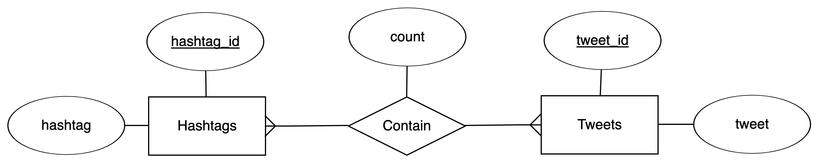
That is, I built three MySQL tables:
- Table
tweetscontains columns:tweet_id(primary key),tweet - Table
hashtagscontains columns:hashtag_id(primary_key),hashtag - Relational Table
tweet_hashtagscontains columns:tweet_id,hashtag_id,count(count each pair oftweet_idandhashtag_id)
Insert Data into SQL Database:
I inserted data downloaded by twitterscraper into the database using Python and the MySQL Python connector.
I found inserting data this way is not the most sustainable way to do it, as errors occurring before committing changes in a transaction leave the transaction hanging and the database locked.
A screenshot of the tables populated with data:
| Tweets Table |
|---|
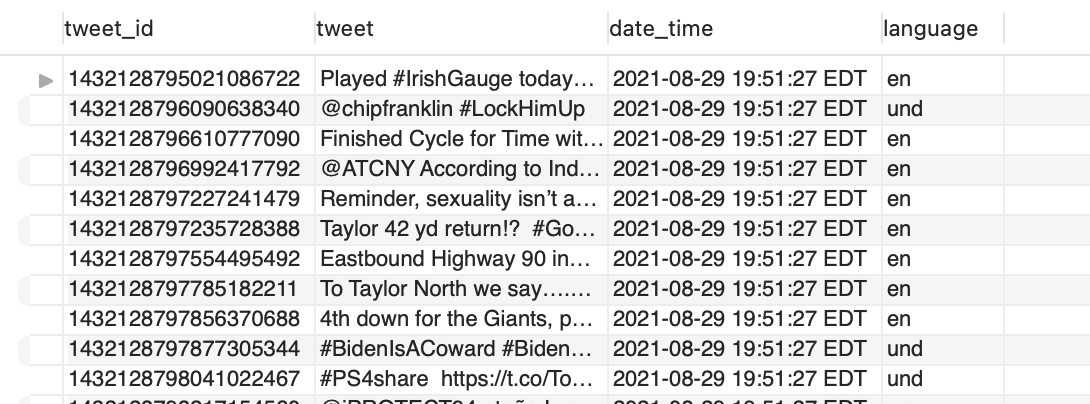 |
| Hashtags Table | Tweet and Hashtag Count Table |
|---|---|
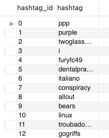 |
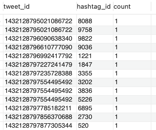 |
Calculate the Probability of One Hashtag Leading to Another Hashtag:
Background Information: Two hashtags can be directly connected by appearing in the same tweet, or can be indirectly connected by connecting through one or more hashtags. In other words, in the example tweet "I love #dogs and #cats", #dogs and #cats are directly connected, because they appeared in the same tweet. If there is another tweet "#cats are the best #pets", this makes #dogs and #pets indirectly connected through #cats.
For the simplicity of the project, I calculated and visualized the probability based only on the direct connection of two hashtags, and then visualized indirect connections via graph clustering and layout (see section below).
The probability of #A leads to #B (P(#A –> #B)) is calculated by dividing the count of #B that occurred with #A in the same tweet by the total count of hashtags in all of the tweets that #A occurred. In other words, this is the percentage of #B among all the hashtags while viewing tweets with #A. Note: This formula makes the probability not the same in both directions (P(#A –> #B) != P(#B –> #A)).
This calculation is done by use of multiple joins, and is then read into a Pandas dataframe using pd.read_sql_query, which looks like:
| Table of Direct Connection Probabilities |
|---|
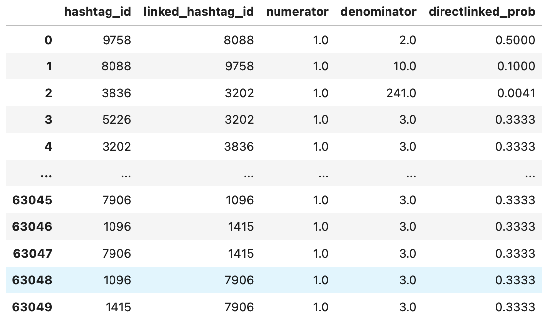 |
Visualizing the Probability (Hashtag Clustering Network):
| Hashtag Clustering Network |
|---|
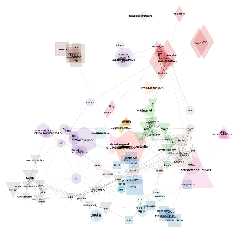 |
Since my goal is to visualize the structure of the hashtag connections, what I would like to do is create a visualization in which hashtags that are strongly connected are visually grouped together. To make it easier to visualize the hashtag clustering network, only the hashtags having a sum(count) > 10 from all tweets are selected, making 166 hashtags are selected for visualization. Networkx is used for representing the graph structure, and for drawing the graph.
To visualize direct connections, the edge weight between two hashtags is used and calculated as the average of P(#A –> #B) and P(#B –> #A). Since the edges only exist between directly connected hashtags, there is no edge lines between hashtags without direct connections. ForceAtlas2 is used for determining the node(hashtag) positions given the edge weight between two hashtags. In general, ForceAtlas2 makes two directly connected nodes with bigger weights closer to each other.
To visualize indirect connections, python_louvain is used for clustering based on graph structure. python_louvain assigns each node with a community/cluster number. And using Networkx I assign the same node color and node shape for nodes with the same community/cluster number.
There are 20 clusters in the graph. To help with visualization, node size is determined by the hashtag frequency of all tweets (bigger size meaning more frequent). Weight edge line transparency is determined by the weight (more transparent meaning smaller weight/fewer co-occurrences).
The graph is suggesting hashtags having similar meaning or in similar categories are more likely to lead to each other (being grouped together in the graph). For example, #twitch is clustered with #gaming, #gamer, #nintendoswitch etc. #covid19, #covid and #getvaccinated are grouped together. Cyptocurrency hashtags are also grouped together. This result perhaps indicates including popular hashtags with more relevance to the new hashtags can help increase the popularity of the new hashtags.