HR Analytics: Job Change of Data Scientists (A Kaggle Challenge)
02 Jul 2021In this article, I will showcase visualizing a dataset containing categorical and numerical data, and also build a pipeline that deals with missing data, imbalanced data and predicts a binary outcome. The original dataset can be found on Kaggle, and full details including all of my code is available in a notebook on Kaggle.
This dataset consists of rows of data science employees who either are searching for a job change (target=1), or not (target=0). Each employee is described with various demographic features. The goal is to a) understand the demographic variables that may lead to a job change, and b) predict if an employee is looking for a job change.
Initial Peek at the Data
Before jumping into the data visualization, it’s good to take a look at what the meaning of each feature is:
- enrollee_id: Unique ID for candidate
- city: City code
- city_development_index: Developement index of the city (scaled)
- gender: Gender of candidate
- relevent_experience: Relevant experience of candidate
- enrolled_university: Type of University course enrolled if any
- education_level: Education level of candidate
- major_discipline: Education major discipline of candidate
- experience: Candidate total experience in years
- company_size: No of employees in current employer’s company
- company_type: Type of current employer
- lastnewjob: Difference in years between previous job and current job
- training_hours: training hours completed
- target: 0 – Not looking for job change, 1 – Looking for a job change
We can see the dataset includes numerical and categorical features, some of which have high cardinality.
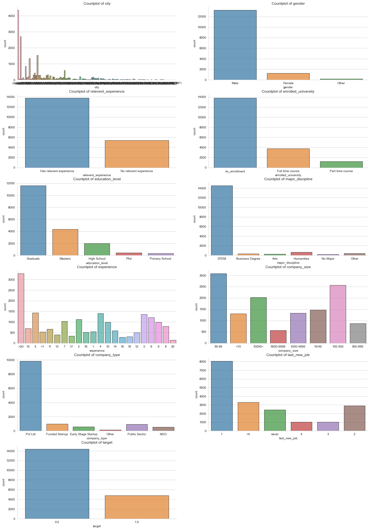
Simple countplots and histogram plots of features can give us a general idea of how each feature is distributed.
| Countplots / Histograms of features |
|---|
 |
| Non-missing data per feature |
|---|
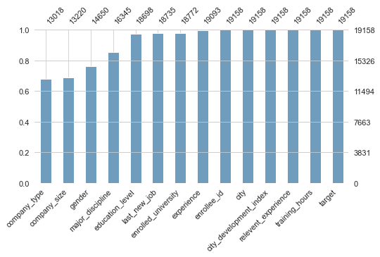 |
There are a few interesting things to note from these plots. First, the prediction target is severely imbalanced (far more target=0 than target=1). Second, some of the features are similarly imbalanced, such as gender. Third, we can see that multiple features have a significant amount of missing data (~ 30%). The pipeline I built for prediction reflects these aspects of the dataset.
But first, let’s take a look at potential correlations between each feature and ‘target’.
Exploring Feature Correlations
What factors are affecting an employee’s decision?
First, I’d like take a look at how categorical features are correlated with the target variable. In order to control for the size of the target groups, I made a function to plot the stackplot to visualize correlations between variables. The stackplot shows groups as percentages of each target label, rather than as raw counts.
I made a stackplot for each categorical feature and target, but for the clarity of the post I am only showing the stackplot for enrolled_course and target. Refer to my notebook for all of the other stackplots.
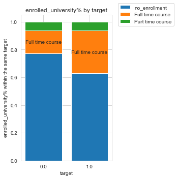
Notice only the orange bar is labeled. That’s because I set the threshold to a relative difference of 50%, so that labels for groups with small differences won’t clutter up the plot. We can see from the plot that people who are looking for a job change (target 1) are at least 50% more likely to be enrolled in ‘full time course’ than those who are not looking for a job change (target 0). In other words, if target=0 and target=1 were to have the same size, people enrolled in ‘full time course’ would be more likely to be looking for a job change than not.
Visualize the correlations between numerical features and target
I used violin plot to visualize the correlations between numerical features and target. A violin plot plays a similar role as a box and whisker plot. It shows the distribution of quantitative data across several levels of one (or more) categorical variables such that those distributions can be compared.
This is the violin plot for the numeric variable city_development_index (CDI) and target. We can see from the plot there is a negative relationship between the two variables.
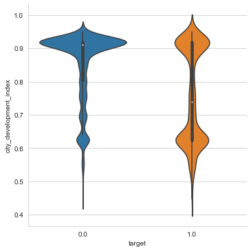
More specifically, the majority of the target=0 group resides in highly developed cities, whereas the target=1 group is split between cities with high and low CDI.
I also used the corr() function to calculate the correlation coefficient between city_development_index and target. I got -0.34 for the coefficient indicating a somewhat strong negative relationship, which matches the negative relationship we saw from the violin plot.
Overview of Pipeline
The pipeline I built for the analysis consists of 5 parts:
- Data preprocessing: First I preprocess the data by performing label encoding of categories. I do this because KNN imputer expects label encoded data. But there are a couple of subtle things to get right:
- Only label encode columns that are categorical.
- Don’t label encode null values, since I want to keep missing data marked as null for imputing later.
- Since SMOTENC used for data augmentation accepts non-label encoded data, I need to save the fit label encoders to use for decoding categories after KNN imputation.
- Train/test split: Split into training and testing sets. I make sure to split before imputation or data augmentation so that training set information does not leak into the test set.
- Data imputation: Impute the significant amount of missing data using KNN Imputer.
- Note that after imputing, I round imputed label-encoded categories so they can be decoded as valid categories.
- Data augmentation: Augment the target=1 class in the training set using SMOTE, specifically SMOTENC. This attempts to improve the trained classifiers by correcting the imbalanced classes.
- Training: Train a Catboost classifier and tune hyperparameters using Bayesian optimization with Gaussian Processes. Hyperparameter tunning proceeded in two steps, following the Catboost documentation:
- Choose an appropriate number of iterations by analyzing the evaluation metric on the validation dataset. Catboost can do this automatically by setting
eval_metric='AUC'. I found that the best number of iterations is 372. - Now with the number of iterations fixed at 372, I ran k-fold Bayesian optimization to tune the other hyperparameters. The optimal hyperparameters I found were:
 {
 'learning_rate': 0.26303264462846715,
 'depth': 3,
 'l2_leaf_reg': 10.0,
 'random_strength': -10.0,
 'bagging_temperature': 0.1968690337194276,
 'border_count': 254,
 'n_neighbors': 8,
 'weights': 'uniform'
 }
- Choose an appropriate number of iterations by analyzing the evaluation metric on the validation dataset. Catboost can do this automatically by setting
Results
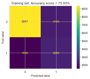
After hyperparameter tunning, I ran the final trained model using the optimal hyperparameters on both the train and the test set, to compute the confusion matrix, accuracy, and ROC curves for both.
| Training Set | Testing Set |
|---|---|
 |
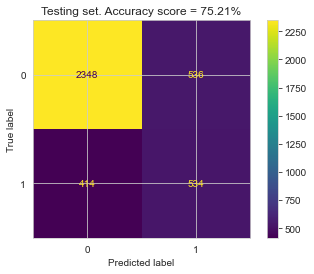 |
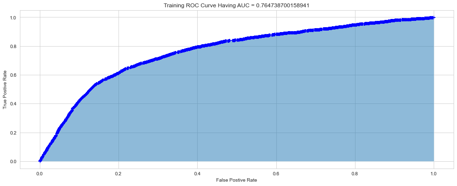
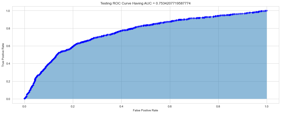
The relatively small gap in accuracy and AUC scores suggests that the model did not significantly overfit. Thus, an interesting next step might be to try a more complex model to see if higher accuracy can be achieved, while hopefully keeping overfitting from occurring.